
Skewmorphism
Skewmorphism
Wow, that’s a mouth full… I’ll reference it as (sm) for the rest of this post..
If you’ve had a “Smart” phone since the dawn of the Mobile era till now, you’ve probably noticed the way Icons, and screens looked in applications (more life like, or dimensional). You’ve probably also noticed that (sm) went away over time in favor of a more flat looking experience.
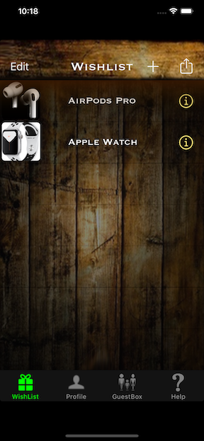
The first app I published ro the App Store in 2012, HushBox, presents the user interface inside a wooden box with items inside it. This kind of treatment of varying transparancies took a while to get right, however I’m quite proud of it from a design stand point.
HushBox w/(sm)
Video
Please Click or tap the right corner pop out icon - (a limitation with iframes in MD files):
Contact me if you’d like to see how this was accomplished.
I’ve always been a fan of using transparencies and blur effects to provide focus on icons/text in UI design/UX. You can see many examples of this in the current iOS 13. There’s evidence of (sm) in iOS, and most definietly in macOS today, but as tech evolves, new concepts emerge.
With VR advances, will a mobile apps OS get revamped top to bottom? Most likely not, due to the cpu demand. However, there are speculations swirling around the web that Anisotropism may be a reality some day.
Here’s a blog on the subject: https://www.macobserver.com/news/erasmus-quantum-leap-ui/