
Code Convention, Practices, SwiftUI ViewModifiers

Coding Conventions
Coding conventions aka Style Guides are really useful especially in a collaborative setting (weather in the same office or across the globe)
Usually Style Guides are framed around a programming language, but also can include context of the development environment (IDE), in terms of how.
If you’re in a team setting, or establishing a team it’s a good idea to settle on a Style Guide.
A few choice Benefits:
- Onboarding team members have a reference to the common convention / expectations
- On going readership / understanding of code
- Accellerates comprension of multiple projects
In the world of Swift here are a few Style guides worth looking at:
Practices
Notice that I didn’t use “Best Practices”? Intentional because I’m of the mind set that the “best” part of the phrase should be a given.
Speaking of redundant, when coding, developing, engineering, one tenant is to avoid it at all costs. With this in mind I almost always abstract away a color scheme to use and re-use throughout an app. In Swift, this is a piece of cake (or if you like pie more).
Here’s the contents of a file called AppStyles.swift for example :
import SwiftUI

//MARK: Buttons
struct GreenButtonStyle: ViewModifier {
  func body(content: Content) -> some View {
    return content
      .foregroundColor(.white)
      .background(Color.GreenColor)
      .frame(minWidth: 44, minHeight: 44)
    .cornerRadius(8)
  }
}

struct BlueButtonStyle: ViewModifier {
  func body(content: Content) -> some View {
    return content
      .foregroundColor(.white)
      .background(Color.BlueColor)
      .frame(minWidth: 44, minHeight: 44)
    .cornerRadius(8)
  }
}

//MARK: Colors (from Assets.xcassets)
extension Color {
  static let BlueColor = Color("BlueColor")
  static let GreenColor = Color("GreenColor")
  static let AppBackgroundColor = Color("AppBackgroundColor")
}
(Leveraging ViewModifier in SwiftUI)
And in your content view it can be declared as such:
import SwiftUI

struct ContentView: View {
  var body: some View {
    ZStack{
      Color.AppBackgroundColor.edgesIgnoringSafeArea(.all)
      HStack{
        Button(action: {
           print("Button Tapped")
         }, label: {
           Text("Sign In").padding()
             .font(.title)
         })
          .modifier(GreenButtonStyle())
          .padding()
        Button(action: {
           print("Button Tapped")
         }, label: {
           Text("Sign Out").padding()
             .font(.title)
         })
           .modifier(BlueButtonStyle())
      }
    }
  }
}
Simulator output:
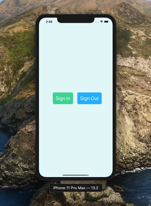
This is one brief example of code reuse and laying a foundation to build a consistent looking app.
Note about colors setup. You can change any of the colors for the buttons or background in 1 place. This is the tip of the ice burg so to speak. If you had multiple apps that could leverage this consistent presentation, you could make a static library or framwork to share across your app suite.
Here’s the sample Xcode project on my GitHub repo if you’re so inclined.
Happy Coding!